
American, Grounded
Jun 7, 2013
The new American Airlines logo
The ’60s and ’70s design icon Massimo Vignelli designed the American Airlines identity back in 1968. At the time, the identity flew miles above other brand programs and was hailed for its simplicity and modern sensibilities, namely its utilization of blue and red, Helvetica and an updated eagle. Even though the design has been loved by designers ever since, the time has come, once again, to bring American Airlines into the modern age.

Before and after
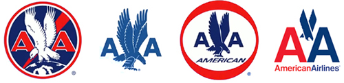
The evolution of the American Airlines logo
Introducing a more vibrant blue and the colour slate into American Airlines word-mark has made for a more evolved logo. The refreshed eagle icon is interesting — however, I don’t think it’s quite there. The implementation of the full logo on the plane doesn’t inspire and is not extremely impactful. The logo may look okay on a white page but should have been designed to look good on a plane first and foremost. The word-mark is typeset in a utilitarian font, as the last iteration of the logo is. But it lacks any personality.

In flight